It all began a little like this...
Ummmm, nope, I'm not kidding.
120 years of termite damage (old damaged combined with
new activity) had finally taken it's toll and things were
getting pretty bad...
to spare you the ugly details...
I'd cover the gaping hole with...
slice their foot as they walked across the floor barefoot.
Yes... a lovely site, I know...
We lived with this "tin-chic" look for years...
Once the project got under way, we made a discovery that put us in the position of making a
pretty big impulse decision:
We found that beneath a heavy coat of plaster on the ceilings, were the original
beadboard ceilings! BUT... only about 6 inches of them was "revealed" from where the wall
came down. Who knew WHAT condition the bulk of them was in beneath the remaining plaster?
Maybe the part we saw was the "good" part and the rest was all damaged and rotten?
After much consideration, we decided to GO FOR IT.
The rest of the plaster was yanked and crow-barred off and this is what we were
rewarded with:
Basically perfect wood! By "perfect" that just means, no gaping holes,
no rotten wood. It wasn't "pretty" by any means, but the condition was stable
and they would look great with a good coating of caulk and paint!
The work progressed...
COUNTLESS trips to the paint store to try out SOOOO many shades of the same color!
One of THE COOLEST things uncovered was the original
handpainted wallpaper that was hidden underneath the plaster on the walls.
We found it on the area of the wall that was revealed when the wall came down.
I saved the little bits of it that I could salvage as well as some cool hand-forged
nails that were in some of the trim work that came down...
FINALLY, paint-day...
The ceiling in the new dining room kept it's plaster -- but underneath...
beadboard, if we ever want to reveal it! NOT! ;)
The wooden ceilings in the new family room space (below) looked SO great sporting their new
"flannel grey" color. So handsome!!
Below, my attempts to reclaim my home after it being torn up for so long...
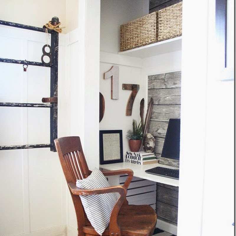
I found a chair and stuck it in there... I HAD to see
that there was going to really be a light at the end of the tunnel! :)
FLOORING DAY ARRIVED
and that is when things REALLY began to
fall into place...
The new floors are hickory wood reclaimed and scraped.
I could not be happier with the choice. It is as though it was
MADE for this house...
Due to a shipping delay, things came to a grinding halt while we waited
for our base moulding to come in...
So,
I pulled a few things from around the house and stuck them in the room --
And in the mornings, I would sit in my one little chair and
dream of the finished product.
My buddy also settled in as well...
He wasn't sure what to make of being photographed,
so he dropped his rawhide treat for a moment and
stood there for me:
Yeah... he's found his little spot as well...
So... we went from three rooms - to two rooms -- one large family room and a very nice-sized
dining room (which we still don't really use....) and it all blends beautifully.
One color dominates the two rooms --
Restoration Hardware's "Slate"... it envelopes the rooms from the
ceiling to the floor, with the exception of the wall below the chair rail
in the dining room (that color is Restoration Hardware's "Cappucinno").
Even the crown moulding is painted Slate so that the line is not broken up at all.
It isn't for everyone, and I don't know that I'd do it all over, in every room because I do love
the look of a crisp white band of crown moulding in a room. But in this application,
where I was going for cozy, warm, handsome, and masculine, it works.
Come walk around the new spaces with me...
We can start here in the dining room...
For now, this is inside the china cabinet.. not what I'm loving, but
one Saturday afternoon, I'll play around in there and get it "just so".
I want to line the back of the cabinet with player piano roll paper...
to lighten it up a bit.
Swinging door going into the mud-room/kitchen area...where it is not so
all-gray and dark... ;)
In the photo below, is my favorite dress form...
Shipped to me all the way from France...
via
Le Trip France.
I named her Vivien -- in honor of my mother.
She is wearing a genuine leopard stole...
Bought in Africa in the 1950's - long before the days that having such things was
verboten... And see the matching pocket book?
LOVE!
I don't use either of them, of course.
They were purchases of my father-in-law when he lived
in Africa. He brought them back for his new bride...
my husband's mother. :)
The FABULOUS French hatmaker's sign on the wall
is from Lisa, at
Urban Farmhouse
More dress forms, decked out in
vintage men's collars...
You can see, we did NOT opt to pull the plaster down off this ceiling...
maybe one day... maybe not... ;)
This one is my next favorite dress form...
so heavy and I love her iron stand.
These two "gals" get along well, so I was able to put them
together here in their own corner...
Are you spotting a theme here??
Player piano rolls???
Hey, you use what you have, right?? ;)
Okay, so I have a lot of dress forms...
This one is from Kasey of Lola B's when she was
selling things from her store.
I love it!!
Hey... for the record, not ALLLLLL of my house is grey... ;)
I love this corner of the dining room...
one lone chair with a vintage straw purse...
Well hello up there, gorgeous... ;)
Now, from the dining room, into the family room...
Some of my fave things that made "the cut" to be put back in
the new space...
Below, a vintage French price sign from sweet Tracie
at
My Petite Maison
One of my vintage hat forms... I love these!!
Crazy, I know... :)
LOVING using my collection of antique player piano rolls...
You knew I couldn't NOT put something old, architectural and chippy in here...
A "matched pair flanking the tv cabinet...
"My" spot... I love sitting here... I knew I would, even before the
furniture ever came back in. Remember where that lone chair sat
back when we only had plywood subflooring in??
Yep... right about HERE..
Behind my chair is an antique French map and two sketches
done by my daughter in her first year as an art major...
All hung from decorative metal hangers bought from my
friend, Lisa, at
URBAN FARMHOUSE
A beautiful old German pewter clock...new to our home,
as it has been in my husband's family for years and we recently
received it. It's perfect in the room...
(One problem when you take pictures in
"cozy" warm, handsome-colored room...
NOT ENOUGH LIGHT FOR PICURE-TAKING!
Sorry for the poor quality on a lot of these!!)
Antique Chinese stand from hubby's grandparents... it was part of a
wedding gift to them back in the early 1900's...
Perfect for a mug or glass next to the chairs.
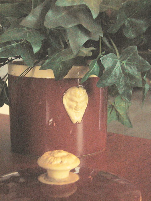
One of many Sarrguemines yellow-ware pieces I have -- I love
the creamy, mellowed colors of this French pottery! The strange
faces on some of the pieces are a bit odd, though. :)
The "sister" spot next to "my" spot in the front of the house...
No one really ever uses this chair... it's waiting for YOU to come
visit and sit with me and talk...
The little powder room in the photo below
still sports the "old" colors that went with our old dining room...
I may get the nerve to paint over all this hand painting/glazing/stenciling...
It is soooo pretty, though... and it goes okay with all the gray, right??
This little bathroom has a door on it that has a large panel of glass
and therefore I always have had to come up with something clever to
cover it... I mean, being a bathroom, and all..
SO... I commissioned sweet Andrea Dickerson from
her Etsy shop,
FADED PLAINS
I just LOVE what she came up with for me!!!
One for each side of the glass... each slightly different.
She incorporated our monogram as well as the year the house was built.
PERFECT!!
So now on to the "living area"...
This is where we "live" now... plenty of room to stretch out and chill...
the big tv is on the right (out of view) and is a fave
of the hubs...
See the funky-shaped wooden thingy on the right on the
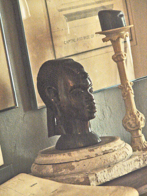
table below? It is an antique African HEADREST!
Can you even imagine using such a thing to rest your head on????
Another treasure from my father-in-law's time in Africa...
This is a very old solid ebony head that my father in law brought back from his
long stay in Africa. It was a favorite of my husband all his life and now
he has it to cherish in his own home...
This whole group (table, pictures, etc. has always been in our
entryway. but I knew this would be perfect with all the gray,
and I just LOVE it in here now!
In the photo below,
see the giant funky ceramic hand-shaped glove form
on the right, on top of the victrola?
That fun piece came from sweet Dawn at
ShabbyChatue

This bunch of heavy, rusty antique floor grates/vents has always just been
displayed on my old grain cart, but when I just couldn't find anything just right
to put in the awkward space over the big tv, I looked over at them and knew they
were just the right thing -- not too busy, not too patterned (to compete with
what's on tv) -- just right.
And so now they're hung and I love them there!
I "filled in" some of them with bits and pieces I already had laying around
and some I left plain...
So, on any given night, as I'm Facebooking
from my laptop,
this is the general vicinity that I will be in...
Sitting here -- chatting with you guys online,
(those of you on Facebook, anyway...)
and just resting...
A lovely place to chill...
Don't you just love the wooden ceiling?? I will NEVER
regret taking the chance to yank down all that plaster and see
the beauty that was beneath!!
Well, thanks so much for allowing me to have you in
for a little bit.
I couldn't be happier with the way things turned out.
A BIG change from their former looks, no?
Much more suited to the equal sharing with the man of the house, I think. :)
He is tolerant of anything I come up with,
but this time, I wanted to honor him with less floral, less pastel,
more handsome, "men's-suiting" look.
And it's fine because I really love that look too...
Love ya!
~Ruth~


